Part3 - 2カラムページ(カスタマイズ 1)
Part3 - 2カラムページ(カスタマイズ 1)
CSSはresetも含めて1ファイルで記述
- 読み込みファイル数を少なくする
<!DOCTYPE html>
<html lang="ja">
<head>
<meta charset="UTF-8">
<meta name="viewport" content="width=device-width">
<title>【コーディング練習】FARM CAPYZOU</title>
<link rel="stylesheet" href="css/style.css">
</head>
reset CSS
- bodyのline-heightは、「1.0」で進めるか「1.7」で進めるかの判断が必要です(今回は、1.0に設定します。)
@charset "URF-8";

/* --------------------------------------
  reset
-------------------------------------- */
*, *::before, *::after {
  margin: 0;
  padding: 0;
  box-sizing: border-box;
}
ul, li {
  list-style: none;
}
a {
  color: inherit;
  text-decoration: none;
}
img {
  max-width: 100%;
  vertical-align: bottom;
}
body
- bodyには、文字設定の基準を記述します
- 背景画像を全面に敷き詰めます
/* --------------------------------------
  body
-------------------------------------- */
body {
  background-image: url(../img/bg.png);
  color: #333;
  font-size: 16px;
  font-family:
    "Helvetica Neue",
    Arial,
    "Hiragino Kaku Gothic ProN",
    "Hiragino Sans",
    Meiryo,
    sans-serif;
  line-height: 1.0;
}
layoutの構造
- mainとasideを横並びしやすいように囲む
- 囲み幅は、テキストでは1240pxになっていますが、幅が広すぎてコンテンツが読みにくいため、「960px」に設定します
/* --------------------------------------
  layout
-------------------------------------- */
.container {
  padding: 20px 0;
  width: min(90%, 960px);
  margin: 0 auto;
}
.main-content {
  margin-bottom: 24px;
  padding: 20px;
  background-color: #fff;
}

@media screen and (min-width: 768px) {
  .container {
    display: grid;
    grid-template-columns: 1fr 280px;
    gap: 30px;
  }
  .main-content {
    padding: 40px;
    background-color: #fff;
    border-radius: 16px;
    box-shadow: 0px 0px 8px rgba(0, 0, 0, 0.16);
  }
  .sidebar {
    max-width: 280px;
  }
}
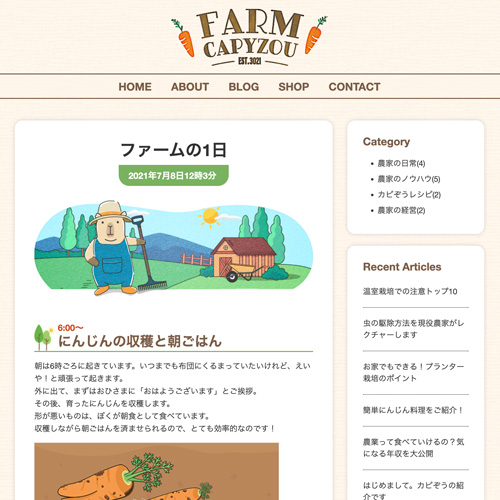
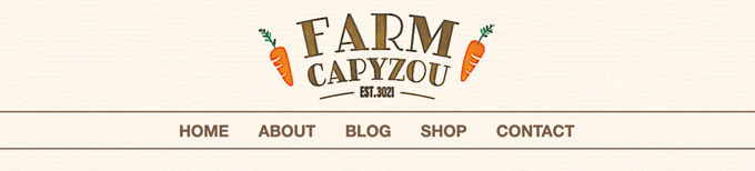
header部
- ロゴは幅「320px」指定をして、marginのautoを指定する
/* --------------------------------------
  header
-------------------------------------- */
.header h1 {
  width: 200px;
  margin: 20px auto 16px;
}

@media screen and (min-width: 768px) {
  .header h1 {
    width: 320px;
  }
}
nav部
- header内にnav部を配置
- nav部の背景色を、白の50%透明にして背景色を透かして見せています
- 「li a」をリンクとして指定する場合、文字間を空ける設定は、2種類あります
- paddingで文字の左右の余白を広げて、クリックできるスペースを拡張する
- gapを指定して、文字間のすき間を空けるのみとする
/* --------------------------------------
  nav
-------------------------------------- */
.gnav {
  position: absolute;
  left: 0;
  top: 130px;
  width: 100%;
  background-color: rgba(253, 245, 233, .8);
  display: none;
}
.gnav ul {
  border-top: 1px solid #7c5d48;
}
.gnav li {
  color: #7c5d48;
  font-size: 18px;
  font-weight: 700;
  text-align: center;
}
  .gnav a {
    display: block;
    padding: 14px 0 12px;
    border-bottom: 1px solid #7c5d48;
  }

@media screen and (min-width: 768px) {
  .gnav {
    display: block;
    position: static;
  }
  .gnav ul {
    display: flex;
    justify-content: center;
    margin: 0 auto 24px;
    border-top: 2px solid #7c5d48;
    border-bottom: 2px solid #7c5d48;
  }
    .gnav li {
      color: #7c5d48;
      font-size: 22px;
      font-weight: 700;
    }
    .gnav a {
      display: block;
      padding: 14px 20px 12px;
      border-bottom: 0;
    }
    .gnav a:hover {
      text-decoration: underline double;
    }
}