ヘッダーパーツ
ヘッダーパーツ
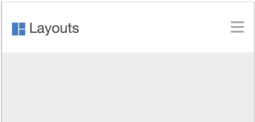
- ロゴとグローバルナビゲーション
ロゴ作成
- 適宜作成

マークアップ
- button要素でクリックできる要素とする(a要素で作成も可)
《index.html》
<!DOCTYPE html>
<html lang="ja">
<head>
<meta charset="UTF-8">
<title>ヘッダーのパーツ</title>
<link rel="stylesheet" href="css/style.css">
<link rel="stylesheet" href="https://cdnjs.cloudflare.com/ajax/libs/font-awesome/6.2.0/css/all.min.css">
</head>
<body>
<!-- .header -->
<header class="header">
  <div class="container">
    <h1 class="site">
      <a href="#"><img src="img/logo.png" alt="Layouts"></a>
    </h1>
    <button class="navbtn">
      <i class="fa-solid fa-bars"></i>
    </button>
  </div><!-- /.container -->
</header>
<!-- /.header -->
</body>
</html>
《style.css》
@charset "UTF-8";

/* ----------------------------------
  reset
---------------------------------- */
* {
  margin: 0;
  padding: 0;
  box-sizing: border-box;
}
ul, li {
  list-style: none;
}
a {
  color: inherit;
  text-decoration: none;
}
img {
  max-width: 100%;
  vertical-align: bottom;
}

/* ----------------------------------
  body
---------------------------------- */
body {
  background-color: #eee;
  color: #222;
  font-size: 16px;
  font-family:
    "Helvetica Neue",
    Arial,
    "Hiragino Kaku Gothic ProN",
    "Hiragino Sans",
    Meiryo,
    sans-serif;
  line-height: 1.0;
}

/* ----------------------------------
  layout
---------------------------------- */
.container {
  display: flex;
  justify-content: space-between;
  align-items: center;
  height: 100%;
  width: min(92%, 960px);
  margin: auto;
}

/* ----------------------------------
  header
---------------------------------- */
.header {
  height: 100px;
  background-color: #fff;
}
.navbtn {
  border: none;
  background: transparent;
  color: #aaa;
  font-size: 30px;
  cursor: pointer;
}
解説
「display: flex;」で、横並びを設定する
justify-content: space-between; の場合
- ロゴ・ナビゲーションボタンとも幅のある面のため左右に分離されて見える
justify-content: flex-start; の場合
- ロゴとナビゲーションボタンとの空きは、ロゴに「margin-right: auto;」の指定をする
可変を前提とする場合には、最大値と最小値を指定する
- 最大値「960px」、最小値「92%」(スマートフォンの時点で左右が、4%ずつ空く指定)
- 92%が960pxより大きい場合は無視され、代わりに960pxが使用されます
.container {
  width: min(92%, 960px);
}
button要素の初期値を打ち消す
- 枠線をなくす
- 背景色をなくす(透明にする)
.navbtn {
  border: none;
  background: transparent;
}
「display: grid;」で、横並びを設定する
- 1fr(fraction: 分数)で、可変を設定
.container {
  display: grid;
  grid-template-columns: 1fr auto;
  align-items: center;
  height: 100%;
  width: min(92%, 960px);
  margin: auto;
}