入門編:フォトサイト2/LP
フォトサイト2:LP
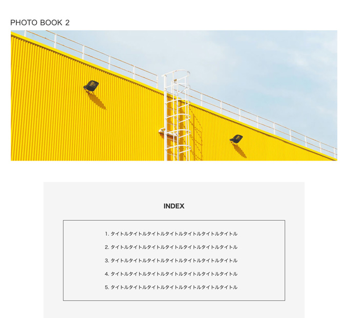
PHOTO BOOK 2

INDEX
1.タイトルタイトルタイトルタイトルタイトルタイトルタイトル
1.タイトルタイトルタイトルタイトルタイトルタイトルタイトル
1.タイトルタイトルタイトルタイトルタイトルタイトルタイトル
1.タイトルタイトルタイトルタイトルタイトルタイトルタイトル
1.タイトルタイトルタイトルタイトルタイトルタイトルタイトル

DETAIL
著者:
タイトルタイトルタイトル
出版社:
タイトルタイトルタイトル
発行年:
2022年1月1日

テキストテキストテキストテキストテキストテキストテキストテキストテキスト
テキストテキストテキストテキストテキストテキストテキストテキストテキスト

オンラインストアで見る

© 2022 PHOTO BOOK 2
<!DOCTYPE html>
<html lang="en">
<head>
<meta charset="UTF-8">
<meta name="viewport" content="width=device-width">
<title>【コーディング練習】フォトサイト2 / LP</title>
<link rel="shortcut icon" href="img/favicon.ico">
<link rel="stylesheet" href="css/style.css">
</head>
<body>
<!-- .header -->
<header class="header">
  <h1 class="site-title"><img src="img/logo.svg" allt="PHOTO BOOK 2"></h1>
</header>
<!-- /.header -->

<!-- .main-content -->
<main class="main-content">
  <img src="img/mainvisual.jpg" alt="メイン画像">
  <div class="wrapper">
    <div class="text-block index">
      <h2>INDEX</h2>
      <ol class="index-list">
        <li>タイトルタイトルタイトルタイトルタイトルタイトルタイトル</li>
        <li>タイトルタイトルタイトルタイトルタイトルタイトルタイトル</li>
        <li>タイトルタイトルタイトルタイトルタイトルタイトルタイトル</li>
        <li>タイトルタイトルタイトルタイトルタイトルタイトルタイトル</li>
        <li>タイトルタイトルタイトルタイトルタイトルタイトルタイトル</li>
      </ol>
    </div><!-- /.text-block -->
    <ul class="image-list">
      <li><img src="img/photo1.jpg" alt="写真1"></li>
      <li><img src="img/photo2.jpg" alt="写真2"></li>
      <li><img src="img/photo3.jpg" alt="写真3"></li>
      <li><img src="img/photo4.jpg" alt="写真4"></li>
    </ul>
    <div class="text-block detail">
      <h2>DETAIL</h2>
      <dl class="info">
        <dt>著者:
        <dd>タイトルタイトルタイトル</dd>
        <dt>出版社:</dt>
        <dd>タイトルタイトルタイトル</dd>
        <dt>発行年:</dt>
        <dd>2022年1月1日</dd>
      </dl>
      <div class="text-wrap">
        <p>テキストテキストテキストテキストテキストテキストテキストテキストテキスト</p>
        <p>テキストテキストテキストテキストテキストテキストテキストテキストテキスト</p>
        <p><a href="#">オンラインストアで見る</a></p>
      </div><!-- /.text-wrap -->
    </div><!-- /.text-block -->
  </div><!-- /.wrapper -->
</main>
<!-- /.main-content -->

<!-- .footer -->
<footer class="footer">
  <p><small>© 2022 PHOTO BOOK 2</small></p>
</footer>
<!-- /.footer -->
</body>
</html>
@charset "URF-8";

/* --------------------------------------
  reset
-------------------------------------- */
* {
  margin: 0;
  padding: 0;
  box-sizing: border-box;
}
ul, li {
  list-style: none;
}
a {
  color: inherit;
  text-decoration: none;
}
img {
  max-width: 100%;
  vertical-align: bottom;
}


/* --------------------------------------
  body
-------------------------------------- */
body {
  color: #333;
  font-size: 16px;
  font-family: sans-serif;
  line-height: 1.0;
}


/* --------------------------------------
  layout
-------------------------------------- */
.wrapper {
  padding: 0 20px;
}
.text-block {
  margin-bottom: 60px;
  padding: 42px 20px;
  background-color: #f4f4f4;
}
  .image-list {
    margin-bottom: 64px;
    background-color: #fff;
  }
  .image-list li {
    margin-bottom: 16px;
  }

@media screen and (min-width: 768px) {
  .main-content {
    max-width: 1000px;
    margin: 0 auto;
  }
  .wrapper {
    max-width: 800px;
    margin: 0 auto;
    padding: 0;
  }
    .text-block {
      margin-bottom: 60px;
      padding: 60px 20px;
      background-color: #f4f9fe;
    }
    .image-list {
      display: grid;
      grid-template-columns: repeat(2, 1fr);
      gap: 16px;
    }
      .image-list li {
        margin-bottom: 0;
      }
}


/* --------------------------------------
  header
-------------------------------------- */
.header {
  padding-top: 60px;
}
.site-title img {
  width: 180px;
  margin: 0 0 14px 10px;
  font-size: 30px;
}

@media screen and (min-width: 768px) {
  .header {
    max-width: 1000px;
    margin: 0 auto;
  }
    .site-title > img {
      margin-left: 0;
      padding: 0;
    }
}


/* --------------------------------------
  main
-------------------------------------- */
.main-content > img {
  margin-bottom: 66px;
}
.wrapper h2 {
  margin-bottom: 30px;
  text-align: center;
  font-size: 18px;
  line-height: 1.5;
}
  .index-list {
    padding: 30px 26px 0;
    border: 1px solid #333;
    font-size: 14px;
  }
  .index-list > li {
    margin: 0 0 20px 16px;
    list-style: decimal;
    line-height: 1.5;
  }
  .info {
    margin-bottom: 40px;
    padding-bottom: 36px;
    border-bottom: 1px solid #666;
    font-size: 14px;
  }
    .info > dt {
      margin-bottom: 8px;
      font-weight: 700;
    }
    .info > dd {
      margin-bottom: 16px;
    }
    .info > dd:last-of-type {
      margin-bottom: 0;
    }
  .text-wrap > p {
    margin-bottom: 16px;
    line-height: 1.6;
    font-size: 14px;
  }
  .text-wrap p:last-of-type {
    margin-bottom: 0;
  }
  .text-wrap a {
    text-decoration: underline;
  }

@media screen and (min-width: 768px) {
  .index {
    padding: 60px;
  }
  .index-list {
    padding: 30px 18% 10px 21.2%;
    font-size: 14px;
  }
    .index-list > li {
      margin-bottom: 20px;
      list-style: decimal;
      line-height: 1.5;
    }
  .detail {
    display: flex;
    justify-content: space-between;
    flex-wrap: wrap;
    padding: 60px 20px 20px;
  }
    .detail > h2 {
      width: 100%;
    }
    .detail > .info {
      width: 236px;
      margin-left: 40px;
      padding-bottom: 0;
      border: 0;
      border-right: 1px solid #666;
    }
    .text-wrap {
      width: 54%;
      padding-bottom: 0;
      margin: 0 36px;
    }
}


/* --------------------------------------
  footer
-------------------------------------- */
.footer {
  padding: 15px 0;
  color: #666;
  text-align: center;
  font-size: 13px;
}